In class we are now working on matte paintings. Matte
painting can be a photo or multiple photos combined with painting done over to
create a whole new mood and/or scene. Given three photos, I had to put them
together to create my matte painting. Only beginning the process we are just
working with adjustment layers to color correct the images to fit together. I
begin with the photo of the man, which he was removed him from the background.
I did this by using quick mask tool and I decided to remove the background
instead of painting over the man to get the selection. This seemed easier to me
after examining the photo. Refine edge was used after getting my selection were
I did a few modifies like smooth edge, shift edge, and contrast. After that I
then placed my newly selected man into a different background which seemed more
adventurous. Now with my man in the new background I needed to replace the sky.
Again I used the quick mask tool to on the sky to get a selection, after that I
deleted it to make room for my new sky. The photo of the new sky to my convenience
fitted nicely and all I had to do was insert the photo. To begin color
correcting I started using color balance on the entire photo and brought out
colors I thought necessary. Then hue/saturation was applied to lighten up some
of the colors. Now I began using levels separately on the three different
images to bring the shadows and mid-tones to the same level.
Brightness/contrast was used on the sky and the man to help with the balance.
To help finish my piece I added a warming photo filter. Last adjustment layer I
added and I thought was necessary was the vibrance and this made the image to
look gloomy. My one thought on the piece while working on it was the achieving
a nondestructive work flow. It’s a step I missed but it was only while working
the quick mask.
Sunday, June 10, 2012
Tuesday, June 5, 2012
Blending Colors with Brushes
For our assignment we had to properly blend colors by using
only the brush tool. To start a quick tip is to use the magic wand on an empty
shape to color in. This is useful because when the marquee appears around that
shape and you start paint it will allow for you to stay within that marquee
line. I first approached the rectangle and begin working with a hard surface brush.
A quick way to obtain a color is to us the eyedropper tool. So I jump around
and still with the hard brush I paint the top, bottom, and couple of strokes in
between those to get a rough of what colors I’m going to blending into. After
that I switch over to a soft brush and start painting in between those strokes.
The blending still wasn’t done and I went back a third time, still with a soft
surfaced brush but this with the opacity and flow turned down to around 85%. This
took care of any eye catching color transitions that didn’t look right. That would
finish my blending for this rectangle shape. Next and for me the more difficult
shape was the circle. I approached this the same way as the rectangle but I soon
realized this was not going to work. To solve one my problems I applied the rulers’
tool so that I can bring the guides out. The guides allowed me to divide the
circle into sections and help me blend and gather colors. Again I started with
the hard brush to color inside the inner circle. That’s the end of hard brush
because it didn’t appropriately for the rest of the blending. Now the soft brush
was my main tool and I went back and forth, painting this circle trying to get
all the colors and to blend properly. Even with the opacity and flow lowered I did
not like the blending that was done. Although very minor the change I did to
help get the blending I wanted was to make the brush size bigger. This helped
and in the end I achieved an accurately close blend of colors.
Sunday, June 3, 2012
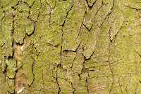
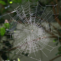
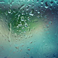
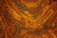
 Creating custom
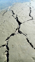
brushes can be done in Photoshop are useful for adding textures. For my brushes
I gathered a few images from flicker.com. Each of the images was enhanced by
using the levels tool. Brightness/contrast was used to touch up a few images
along with the shadow/highlights tool. For the water drops and spider web the
lasso tool was used to get a selection I wanted. Only for the ground with
cracks I converted the image mode into grayscale, then use Threshold to isolate
the cracks. My other two images were left as is. The next step after getting my
custom brush selections was to modify them with preset option. My best preset
brush was the cracks brush. It develops good cracks that could be used for
walls or ground images. The bark and spider web brushes were so so and I could
be improved after explain my troubles for other brushes. Some problems I had are
getting the brush to be realistic and also to flow well. For example the water
drop brush was something I had in mind that I thought ideally could be used on
any object. After doing an image adjustment and making my selection I had spent
some time in the preset option but I could get what I wanted. Along with the
rust brush I wanted to create a texture but as much I played around with the
preset it seems like I couldn’t make a difference. The most I got from the
preset options was different shades. In the end some images worked better than
the other.
Creating custom
brushes can be done in Photoshop are useful for adding textures. For my brushes
I gathered a few images from flicker.com. Each of the images was enhanced by
using the levels tool. Brightness/contrast was used to touch up a few images
along with the shadow/highlights tool. For the water drops and spider web the
lasso tool was used to get a selection I wanted. Only for the ground with
cracks I converted the image mode into grayscale, then use Threshold to isolate
the cracks. My other two images were left as is. The next step after getting my
custom brush selections was to modify them with preset option. My best preset
brush was the cracks brush. It develops good cracks that could be used for
walls or ground images. The bark and spider web brushes were so so and I could
be improved after explain my troubles for other brushes. Some problems I had are
getting the brush to be realistic and also to flow well. For example the water
drop brush was something I had in mind that I thought ideally could be used on
any object. After doing an image adjustment and making my selection I had spent
some time in the preset option but I could get what I wanted. Along with the
rust brush I wanted to create a texture but as much I played around with the
preset it seems like I couldn’t make a difference. The most I got from the
preset options was different shades. In the end some images worked better than
the other.Wednesday, May 30, 2012
Blending Pratice
Here I present you two images that I have blended into one. The goal of this assignment was to use new tools which would be the blending modes, layers styles, and within layer styles the blend if. The images I choose where the Alder Planetarium which I had taken a photo of and I wanted a beautiful sky image which I had to find of the web from flicker.com. My first steps were to color correct both images. Then after that I decided both images were color corrected I put a blending option on them. The sky had multiply and the planetarium had darkened blending modes. By doing this it poorly blended the images so to get a better look I added blend if to the sky to get an equal amount of sky to go through the planetarium image. Last I decided to throw some layer styles on the planetarium.
Tuesday, May 22, 2012
Color Correction 2
To the left you see a photo that I have taken from Millennium Park
in my Chicago area. From it I will display
more color correction techniques to improve this photo. To add more dynamism I selected
two objects from the photo and individually developed upon them. The two
objects I enhanced were the blue and yellow circles. I selected these by using
the same methods and that is by means of color range and quick selection tool. After
which I manage to a get selection around my objects I then applied a refined edge to get a more thorough piece. From here I knew I wanted to work on these objects
first and then balance out theoverall photo/image. Adjustment layers were utilized
and will always be executed from here on out be to perform a non-destructive
work flow. On the blue circle brightness/contrast, levels, and hue/saturation adjustment
layers were used to achieve a more lively blue. Next for the yellow circle the
same adjustment layers were repeated as the blue circle, but I removed the curves
layer later on to better fit the piece. Also with the curves layer removed it
showed more shadows around areas where needed that brought out the shapes of
this artwork clearer. Now with both circled objects color corrected it was time
to fit the background appropriately with those. The first adjustment layer that
was used was the color balance. This did an alright job of bringing out the green
in the trees and it slightly effected the overall environment. It was not until
I applied the hue/saturation layer to get more real green for leaves and
cleaner quality for the concrete and buildings. Also througout using these layers I kept in mind the Crown Fountain (tower with face in the background) to develop and keep its color. Finally the brightness and
levels layers were the last touch to my photo to bring a pleasant clear day. You can see resluts below.
Color Correction 1
Here are my color corrected pictures. Displayed on the left sides
are the original picture and the right side is my work. So first is the bird
which I ended up having an old photo feel to it. Right away I noticed an issue
with the upper left corner that casted a shadow, bringing the brightness up in
the photo made that part very distorted so I decided to turn the brightness
down. By bringing down the brightness it lowered many tones of the pictures
colors, so my next step was to use the levels tool to bring out some mid-tones along
with a slight brightness to the birds feathers. Still the photo had an
unnatural look and to fix this I added curves that improved the red color of
the bird’s beak and at the same time incorporated a nice mellow yellow to
overall photo.
Next for the rooster in the shadow I immediately knew I wanted
to make it a day scene. Being the photo was really dark I started with the levels
tool to quickly get a rough day scene. After that I used blue channel within
the curves tool to lightly add blue to it. Now at this point this I kept
rolling and decided if I was going to add brightness/contrast to this photo it
was no longer going to be a day scene, but an morning scene with the idea of
the sun being above the rooster. With the limitations of only use the top image
adjustments for Photoshop for this assignment I used curves again to bring some
color in the photo. Lastly to convey a shine around the roosters head and back the
levels tools was used.
Now for the Quirigua monument I started off going for night
scene. I do so at first with the brightness by lowering it. Then with the
levels tools I ended up bringing out a cleaner darker green for the leaves and
the grey tones with the monument. Now to my surprise I wanted to make to sky
darker and so I thought that by using the blue channels within the curves this
would do the job, but instead it made the trees and grass greener. Here is
where my original idea switched from night to just improving the photo overall
into a beautiful day. I went and added a second brightness/contrast and notched
them up. And lastly I incorporated another curves this time from the green
channel and this made everything come together attractively.
Proffiency
Here is a collage I have made for my Game Design II class.
We were to find a poem or haiku and create an inspirational piece from it. After
finding a haiku that I liked it was now time to put a picture to it. With the haiku
that I picked I wanted to go for twilight zone feel, almost calm but eerie. The
next step was to find an image which was done on flicker.com. The background,
communication tower, flat line, hand print, space ship, and the silhouette of
the house are all separate images that have had selections removed them. The
selections tools I used were the magic wand along with quick selection. For the
communication tower I took a different approach and used the color range to
remove the background and leave the tower by its self along with the grassland.
Almost all of these selections were put into mask layers. Also I used some
adjustment layers to balance out the picture. And for the flat line and hand
print different blending modes were applied to fit the whole image. These were
the main steps I used to create my collage.
Subscribe to:
Posts (Atom)


